Geospatial
<- Return to all blogs
-
Building Interactive D3 Dashboards with CARTO Web Maps
This post details the design process we used to build a D3 dashboard, highlighting some of the key pieces of code needed to get CARTO and D3 talking to one another.
-
Building Interactive D3 Dashboards with CARTO Web Maps
This post details the design process we used to build a D3 dashboard, highlighting some of the key pieces of code needed to get CARTO and D3 talking to one another.
-
Creating an Interactive Visualization of Air Pollution for a Museum
This post describes our design process and the evolution of an interactive application relating to air pollution monitoring in a museum.
-
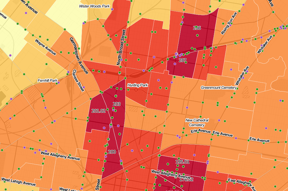
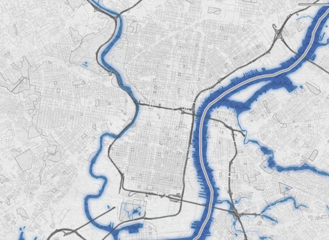
Geography of Crashes in Philadelphia
In this post, we analyze the relationship between severe road crashes, the geography of crashes, and demographics.
-
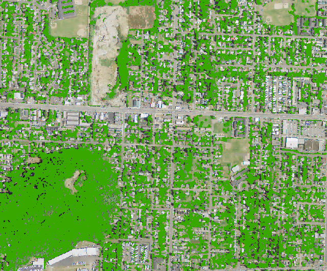
Using NAIP Imagery and a Texture Raster to Model the Urban Forest
This post walks through a method to help increase accuracy of classification by using a texture raster to distinguish between trees and other vegetation.
-
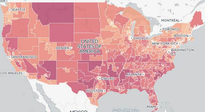
Redistricting Roundup: 2016 Edition
In this blog we give an update on all of the redistricting litigation and news we tracked during the 2016 election cycle.
-
2015 Fatal Crash Data by Congressional District Released
In this post, we take a look at the geography of fatal crashes by Congressional district in the U.S in response to the recent release of the 2015 Traffic Fatalities data and call to action.
-
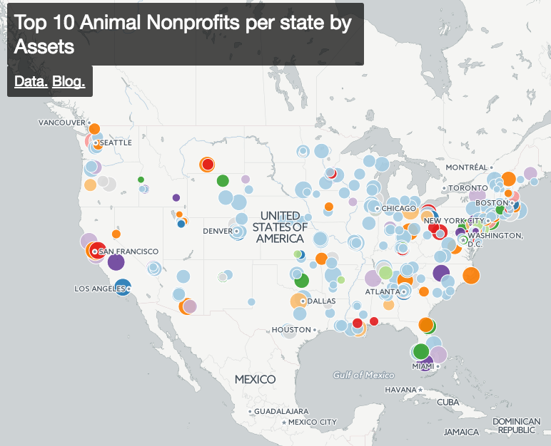
Getting Started Exploring All 1.5 Million Nonprofits in the US
In this post we discuss how to find and categorize data about all of the 1.5 million US nonprofits.
-
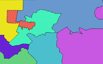
Measuring District Compactness in PostGIS
In this blog we discuss strategies for measuring district compactness in PostGIS.
-
Serving Local Mapbox Vector Tiles with Docker
In this post we outline how to serve local Mapbox vector tiles with Docker.
-
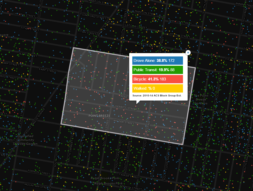
How Philadelphians Get To Work: Calculating Mode Share and Dot Density Maps in CartoDB
In this post we calculate mode share and dot density maps in CartoDB to depict how Philadelphians get to work.